Deliverables: Website, Print Collateral, Brand Guidelines, Apparel
Agency: Sequence
Role: Designer & Co-Art Director
Creative Director: Douglas Dauzier, Heidi Reinfeld
Co-Art Director: Robin Eusebio Silva
Designers: John Kim, So Jin Park
Deliverable: Website, Print Collateral, Brand Guidelines, Apparel
Agency: Sequence
Role: Designer & Art Director
Creative Director: Douglas Dauzier & Heidi Reinfeld
Additional Designers: Robin Eusebio Silva, John Kim, So Jin Park
Deliverable: Website, Print Collateral, Brand Guidelines, Apparel
Agency: Sequence
Role: Designer & Art Director
Creative Director: Douglas Dauzier & Heidi Reinfeld
Additional Designers: Robin Eusebio Silva, John Kim, So Jin Park
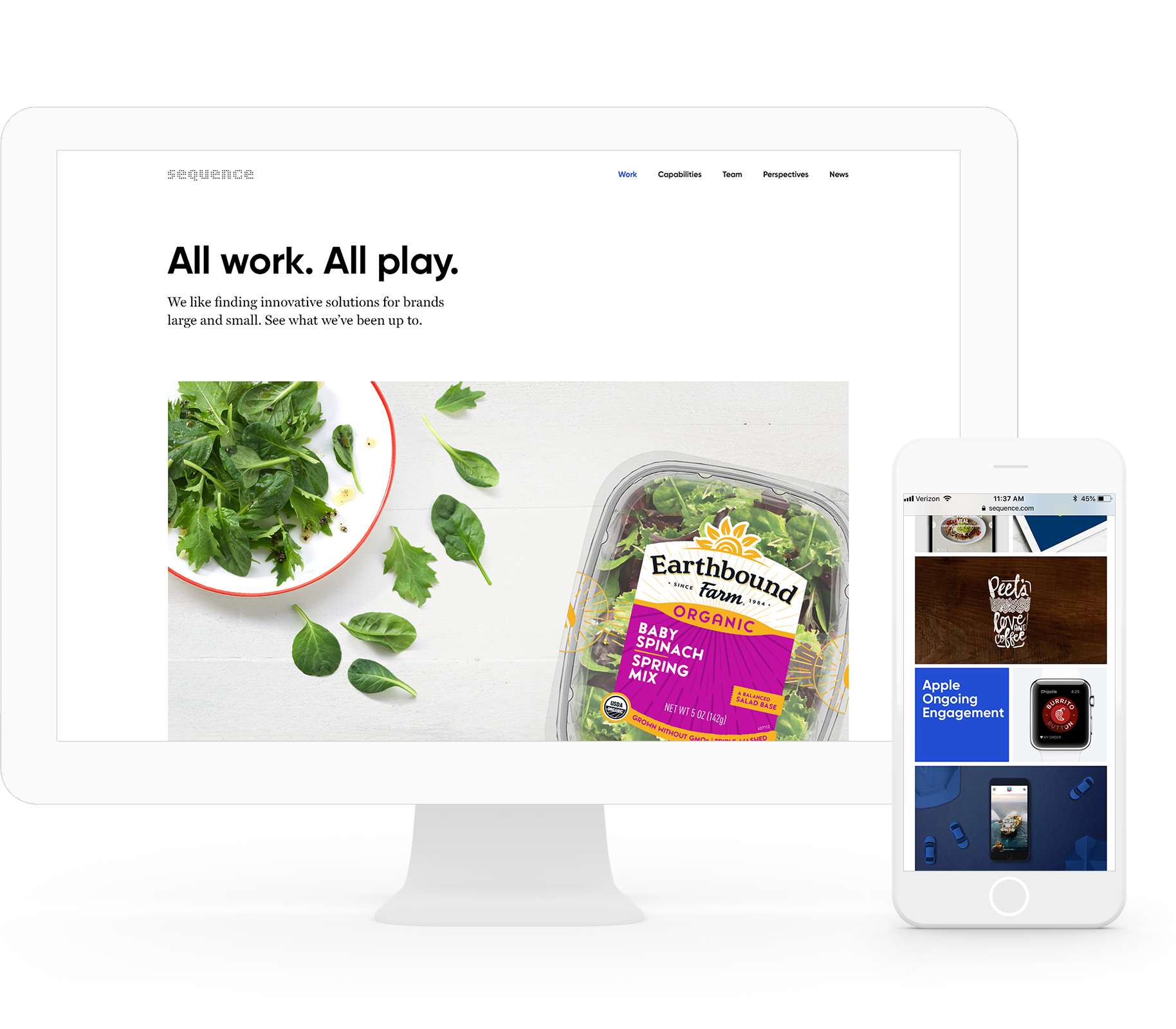
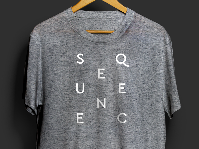
Sequence Brand Refresh
With more than a decade of being in business, two thriving offices, and a body of undocumented work, it was time to refresh the Sequence website. In examining the current state and overall brand, it quickly became clear that Sequence was due for more than just a site update. Needless to say, it was a collaborative effort.
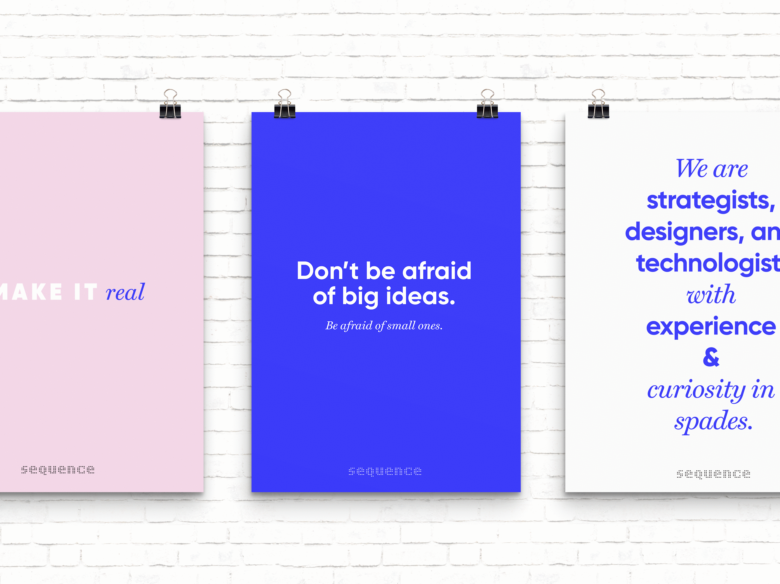
The team and capabilities had transformed over the years, and the brand needed to reflect the design-driven transformation that Sequence was so capable of offering clients. A simple design system was formed to connect to the brand characteristics of smart, approachable, bold, and thoughtful.
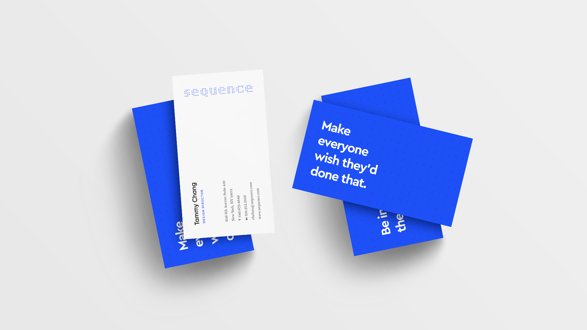
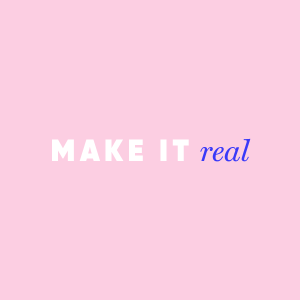
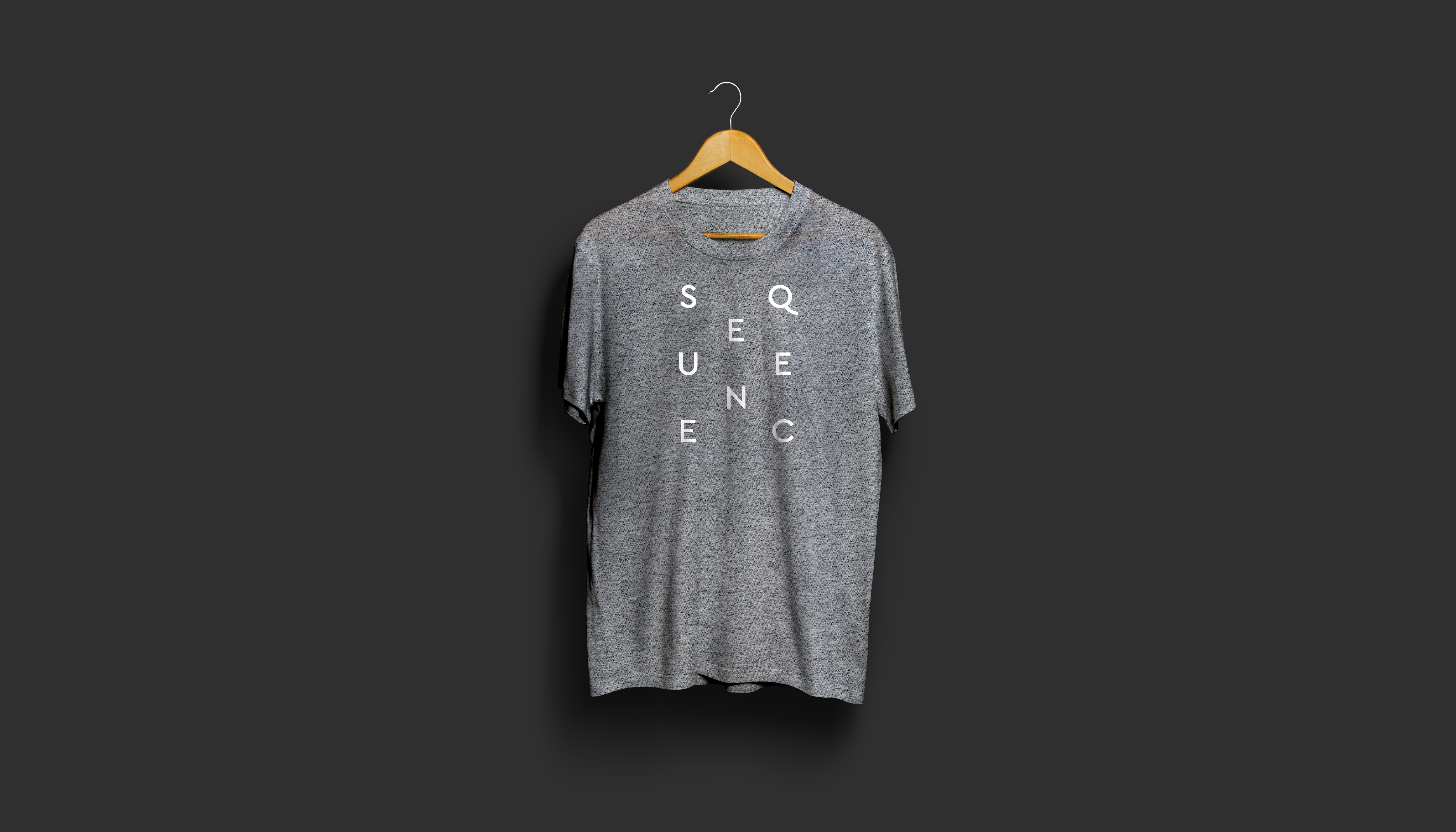
The logo was maintained for continuity, and a secondary S mark was added for flexible use across media. A modern san serif typeface paired with a more sophisticated serif for body text compliments the logo and represents the approachable nature of the studio.
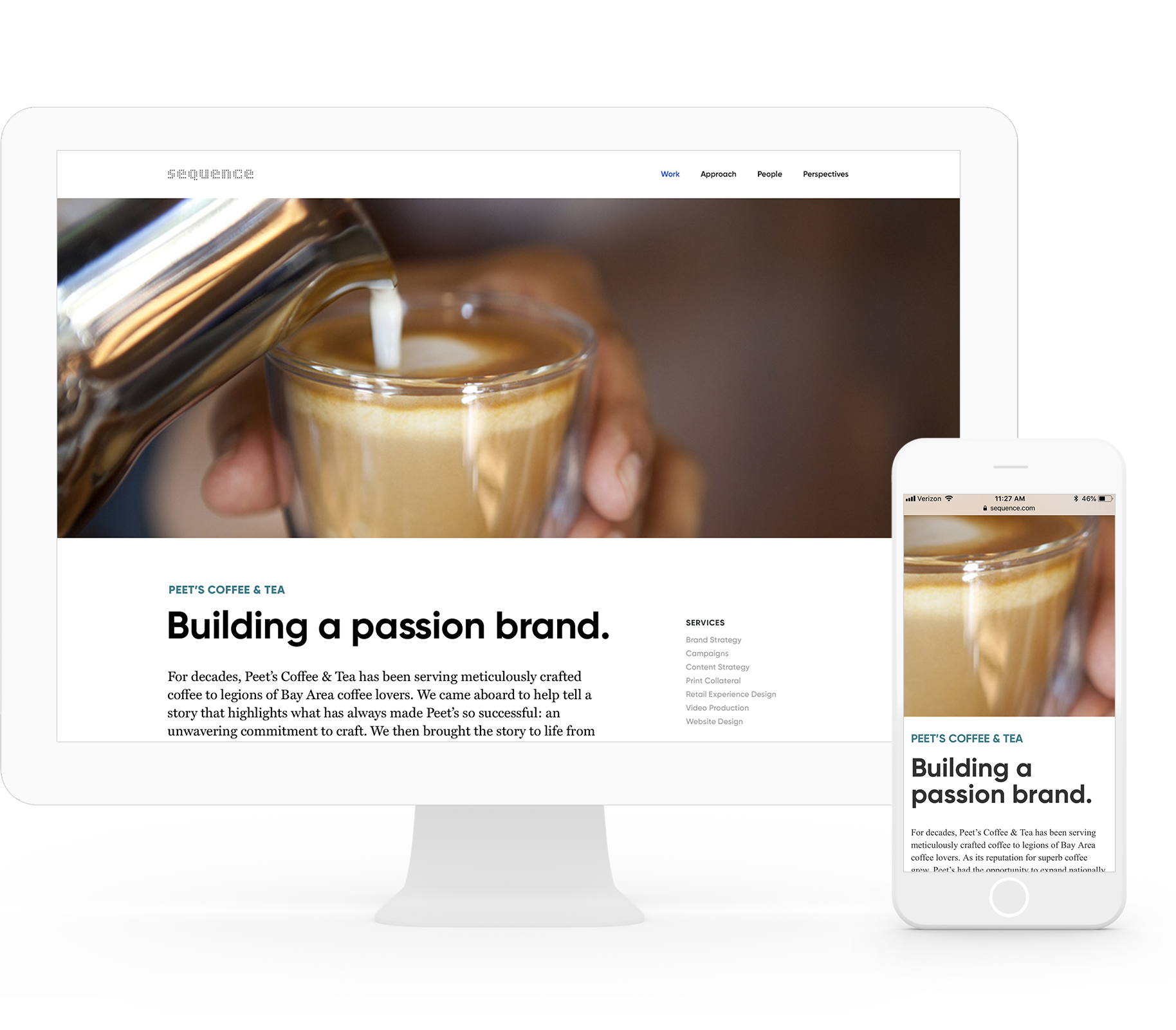
Sequence Brand Refresh
With more than a decade of being in business, two thriving offices, and a body of undocumented work, it was time to refresh the Sequence website. In examining the current state and overall brand, it quickly became clear that Sequence was due for more than just a site update. Needless to say, it was a collaborative effort.
The team and capabilities had transformed over the years, and the brand needed to reflect the design-driven transformation that Sequence was so capable of offering clients. A simple design system was formed to connect to the brand characteristics of smart, approachable, bold, and thoughtful.
The logo was maintained for continuity, and a secondary S mark was added for flexible use across media. A modern san serif typeface paired with a more sophisticated serif for body text compliments the logo and represents the straightforward
Sequence Brand Refresh
With more than a decade of being in business, two thriving offices, and a body of undocumented work, it was time to refresh the Sequence website. In examining the current state and overall brand, it quickly became clear that Sequence was due for more than just a site update. Needless to say, it was a collaborative effort.
The team and capabilities had transformed over the years, and the brand needed to reflect the design-driven transformation that Sequence was so capable of offering clients. A simple design system was formed to connect to the brand characteristics of smart, approachable, bold, and thoughtful.
The logo was maintained for continuity, and a secondary S mark was added for flexible use across media. A modern san serif typeface paired with a more sophisticated serif for body text compliments the logo and represents the approachable nature of the studio.

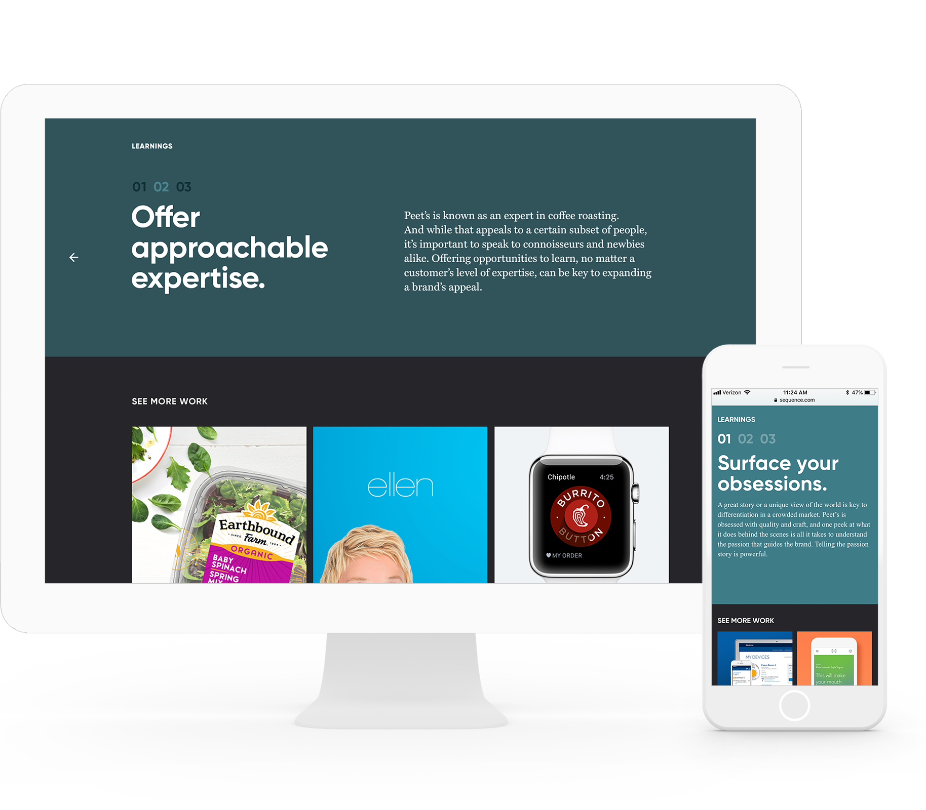
MORE WORK
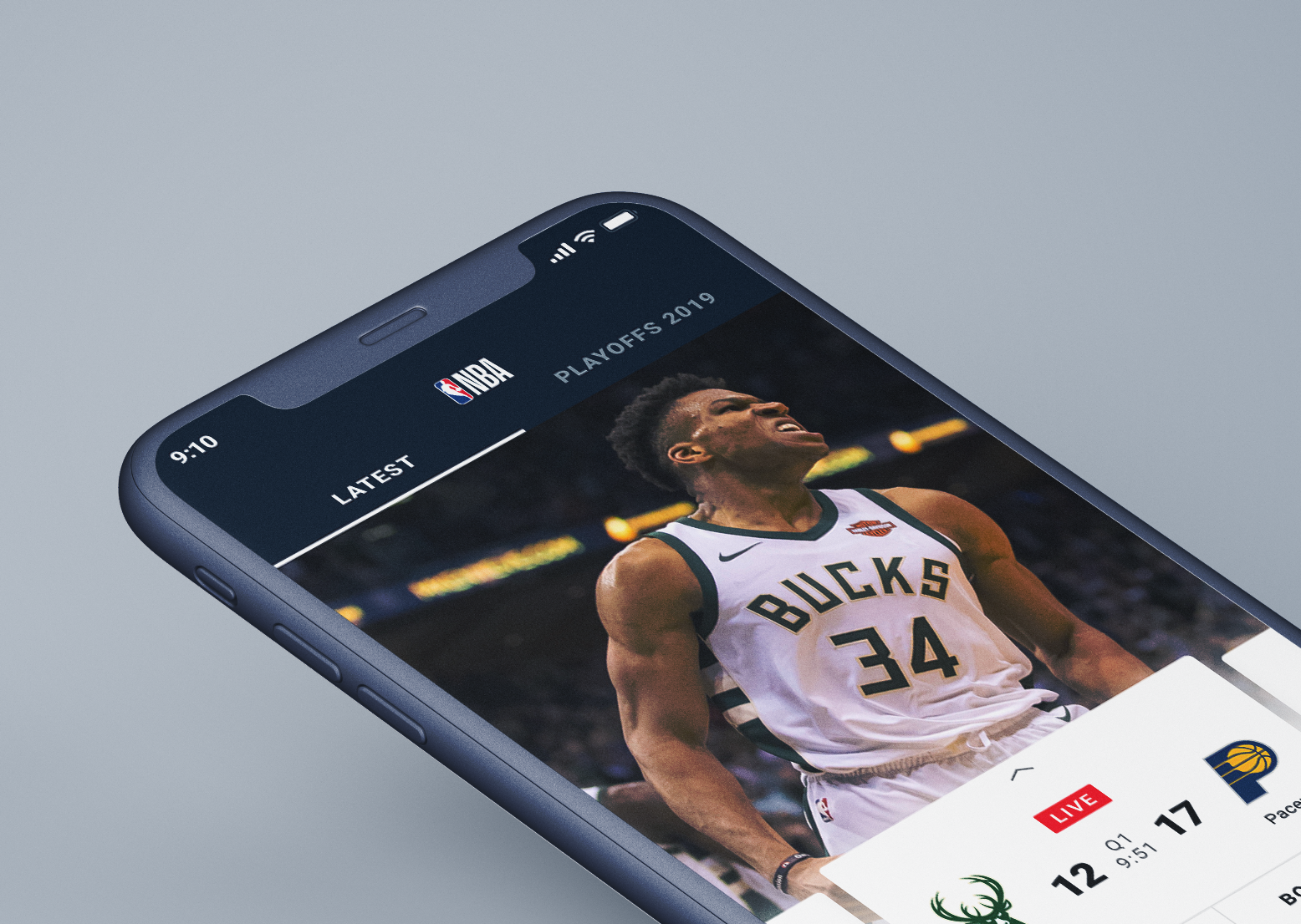
NBAInternational App
Chipotle Digital PromotionsMobile Game Design
New York PhilharmonicWebsite
LuvoMobile App
SalesforceMobile App, Concept
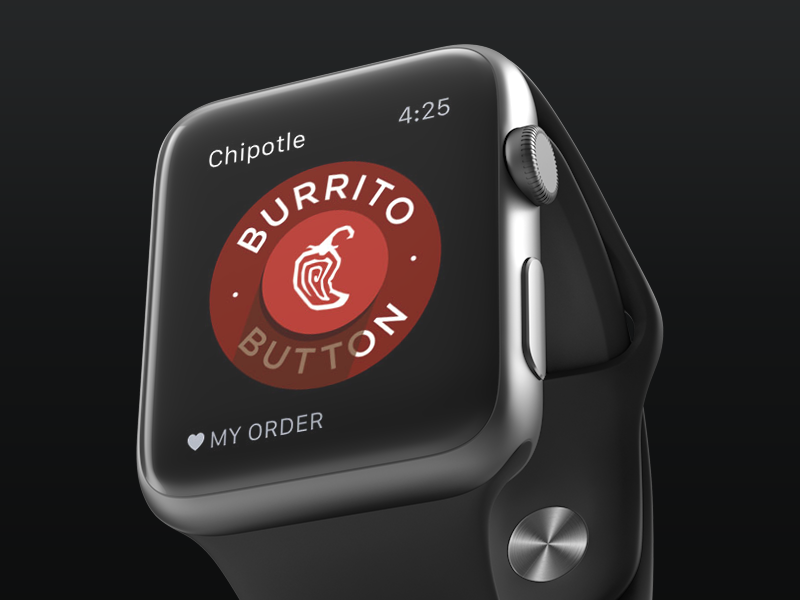
Chipotle Apple WatchOnline Ordering Experience
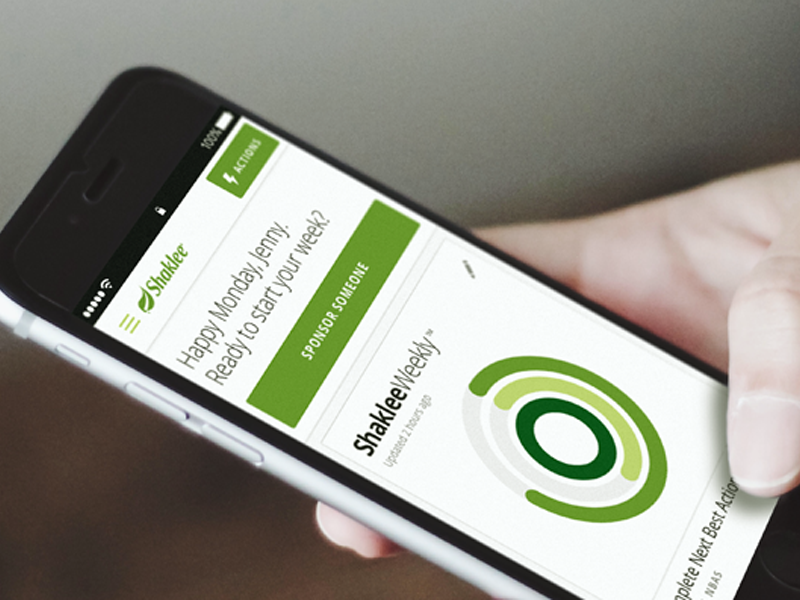
ShakleeWeb App

Facebook for BusinessBrand Expression
SequenceBrand Refresh
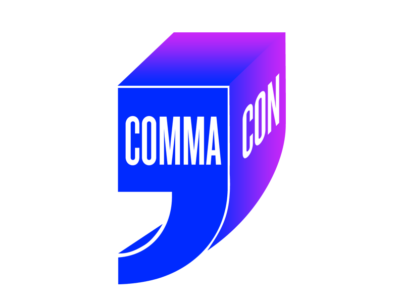
Facebook Comma-ConEvent Identity
Chipotle MarketingPrint
©2018 CHELSEA GIL GET IN TOUCH